Brands have long ceased to be simply the advertised image of a company. Today more than ever, brands interact with their customers in a digital way: social networks, landing pages, email, etc., and maintaining a consistent appearance is vital.
On the other hand, digital product development teams are becoming larger and more specialized, and it is no longer enough to keep the marketing and IT teams synchronized with some corporate rules. Now they need specialized tools that allow them to maintain a brand image consistent and, at the same time, allow them reuse work.
Let’s start from the beginning
Since its proposal in 1994 and its initial release in 1996, Cascading Style Sheets (CSS) evolved from a static description of simple styles to being the key of modern web design. However, CSS was designed to list and specify the styles used in a website and not as a programming language, therefore, its dynamic characteristics are quite limited.
Reusing styles often means copy-pasting or changing parent-child relationships, which can compromise the specificity of the selector. And the lack of variables and functions to reuse parts of the code makes changing the same value in multiple CSS files (such as primary color or font size) very difficult to maintain and there is a high risk of sets the wrong values.
The preprocessors improved the developer experience, turning CSS into a full programming language.
To resolve these shortcomings, the CSS preprocessors such as SASS and LESS were created. The preprocessors improved the developer experience, turning CSS into a full programming language with new functionality like variables, nested selectors, functions, color operations, logical operators, imports, etc. sometimes with a CSS like syntax, which makes it more readable and easier to maintain.
Despite this new advantage, we still have a static code that, once processed and loaded by the browser, can no longer be dynamically modified. This forces us to contemplate all the variations that we want to have available by adding hundreds of classes and modifiers that should be managed with media queries or changing the tags’ classes through JavaScript.
In 2015, the CSS Custom Properties for Cascading Variables Module Level 1 became a W3C Candidate Recommendation, introducing cascading variables that are accepted by all CSS properties. This new feature might seem quite simple but it offers the ability to do many of the things that preprocessors used to do, and also enabled new workflows that were not possible before.
Design Systems, the new era!
Recently, a new concept is becoming popular in the UX and Web Development arena: Design Systems.
Design Systems are tools that provide the essential infrastructure to guarantee design quality and development efficiency. They can range from a few concepts such as branded colors and typographies, to any element that defines the appearance of the application and its interaction with the user: components, templates, usability, tone of voice, etc.
Design Systems are tools that provide the essential infrastructure to guarantee design quality and development efficiency.
A good use of the Design Systems helps to improve production speed and communication, facilitate consistency, simplify and scale the product, achieve visual coherence, build new features more efficiently, keep more focus on UX, bring clarity to developers, reuse code and incorporate new components easily.
The work of designers who create or contribute to a Design System should mimic the world of the developer, doing more technical work and ensuring that they are designing in a reusable and systematic way. There are several areas where designers can contribute: Design Tokens, Components Libraries, Documentation, etc., but from now we are going to focus on Design Tokens.
Configuring your digital brand Design
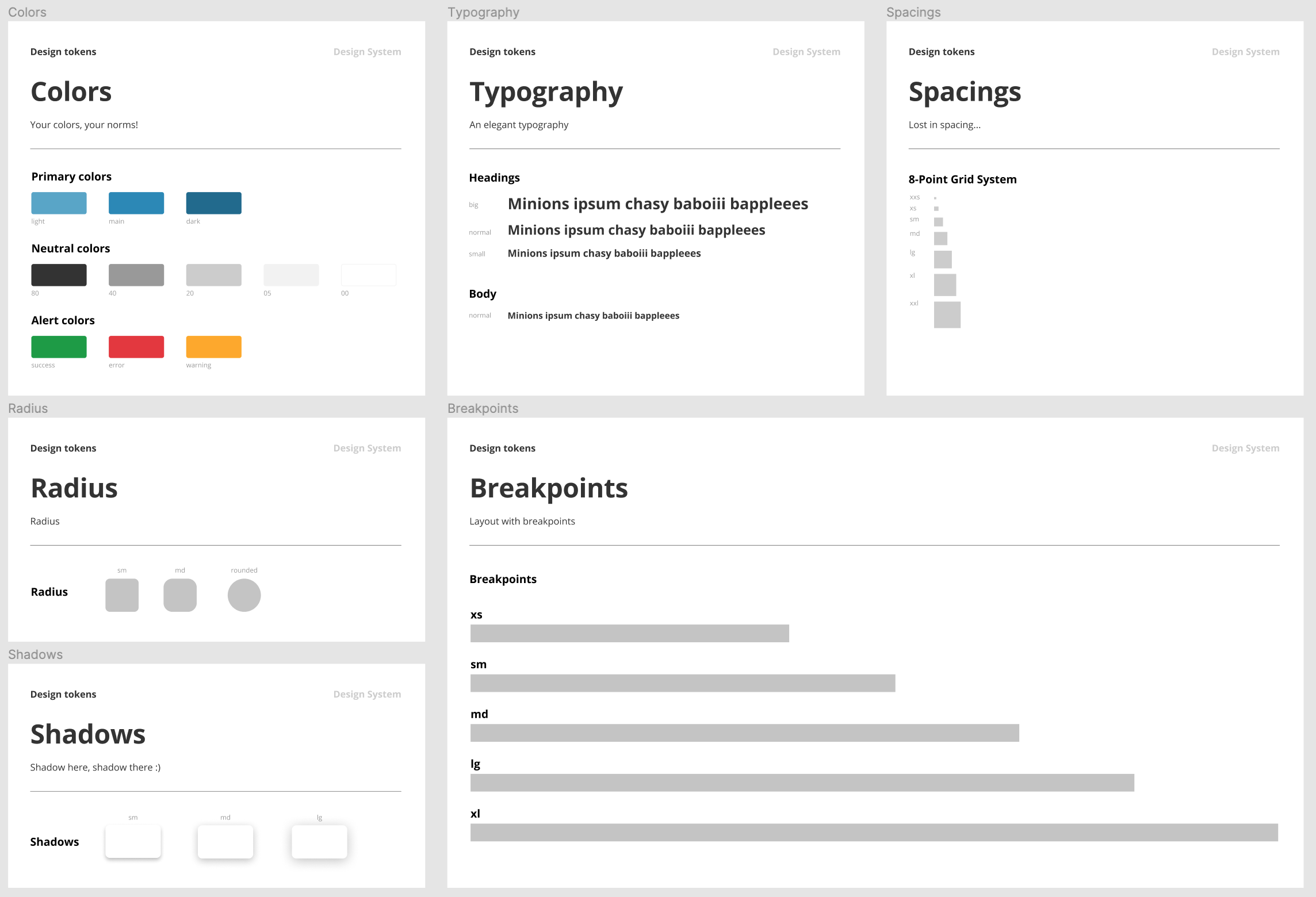
Tokens are values that define features such as typography, colors, icons, spaces, etc. that will then be used to configure the styles of the application. They are the essence of the brand in a digital context. Design Tokens are intended to be flexible and cross-platform, therefore building it in a common language is paramount.
Figma and Adobe XD have empowered developers to link their code with the designers’ prototypes in a very direct way to keep a single source of truth.
At the same time that designers have been delving into the design of components and templates in an increasingly precise and collaborative way, new applications such as Figma and Adobe XD have also appeared and empowered developers to link their code with the designers’ prototypes in a very direct way.
With applications like Dragoman, Style Dictionary or the Adobe XD extension for VSC, the values used on UI sketches for color, typography, or spacing can be extracted as SCSS variables, JS variables, JSON, custom properties (CSS variables), or any other custom format. This allows maintaining a single source of truth from designs to the variables that configure the application’s style sheets, regardless of the language chosen to generate them.
Let’s rock!
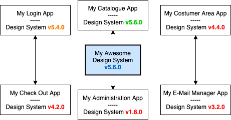
Design Systems help organizations to maintain design coherence among all their front-end applications by sharing the same Design Tokens across the company.
A way to use these Design Tokens is to incorporate them as a dependency. This method, which usually involves a version control, makes it easier to manage changes in the code and helps to avoid errors when CSS files are preprocessed (with SASS or LESS) or exported from JavaScript (with any ‘CSS-in-JS’ technique).
Over time, all the effort that has been invested to keep the organization’s brand ends up in vain.
However, this strategy makes the applications use, gradually, more outdated versions of the libraries than without a scrupulous dependency updating. Over time, all the effort that has been invested to keep the organization’s brand ends up in vain, because a design requirement such as a color change or a logo update can take days, weeks or months to be adopted by all the applications.
How can we take full advantage of Design System?
We will have dynamic styles that can be adapted to different color settings, screen size, device, etc.
As previously described, since 2015 Cascading Style Sheets incorporate Custom Properties that allow us to use CSS variables directly from the browser itself. On the other hand, we have a cross-project that can transform Design Tokens into Custom Properties that can be load in the browser before the own applications’ style sheets.
With that environment, we will have dynamic styles sheets that may adapt all his colors, sizes, fonts, etc. from a few initial variables that define the primary or most abstract level of the brand. And the rest of the components and applications are going to configure his specific variations extending from there.
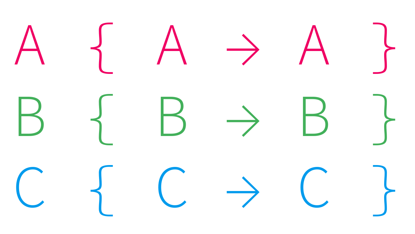
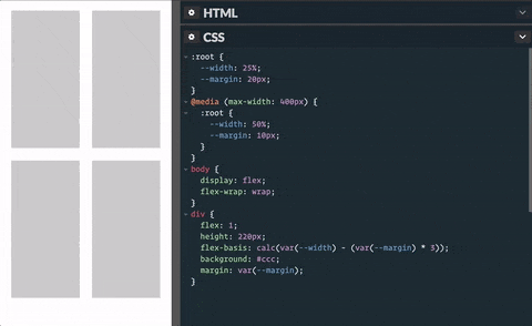
And the amazing thing is that it is also possible to reset variables, for example within media queries, and have those new cascade values everywhere. Something that is not possible with preprocessor variables. Check out this example:
If you are still not impressed, take a look at another demo where, using JavaScript to reset some CSS variables, the appearance of the page changes on the fly.
Happy coding!